
If you’ve ever waited on a weekly report to know how your practice is really doing — or pieced together call logs, message exports, and a teammate’s memory to answer a simple question like “were we overwhelmed with calls on Tuesday?” — Spruce Dashboards is built for you.
The Challenge: getting a clear picture of practice communication
Most practices don’t lack data. They lack a place to see it.
Call volume lives in one system. Messages in another. Whether a fax or teammate coverage held up on a heavy afternoon usually surfaces after the fact — in a review, a complaint, or a resignation — instead of in time to do something about it. And when someone did want a real answer, it meant exporting reports, stitching together spreadsheets, or waiting for someone else to pull the numbers together.
That gap between “what’s happening in your practice” and “what you can actually see” is what Spruce Dashboards closes.
What’s new
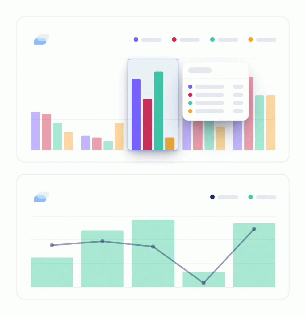
Spruce Dashboards puts your practice’s communication activity — calls, messages, fax, email, video visits, and teammate activity — in one place, right inside Spruce. No separate tool, no manual export, no waiting on someone else to pull a report.
- On by default. Every active Basic and Communicator organization already has it enabled. There’s nothing to request or set up.
- Admin-only. Non-admin teammates won’t see the Dashboards page directly, but admins can export or print any view to share with the team.
- Web and desktop. Dashboards aren’t available on mobile — this is a sit-down, look-at-the-numbers kind of tool.
- Covers the last 7 days, refreshed regularly, so there’s always a current picture to check in on.
Every Spruce plan gets a dashboard — Basic and Communicator each get one built for how they work.
Basic gets a single-page activity view: inbound volume by channel, video call completion, scheduled message volume, and a clear path to upgrade for deeper reporting.
Communicator unlocks the full advanced analytics suite — five tabs of reporting most practices have never had this easily accessible before.
What Communicator unlocks
If you’re on Communicator, here’s what’s now available inside Settings → Dashboards:
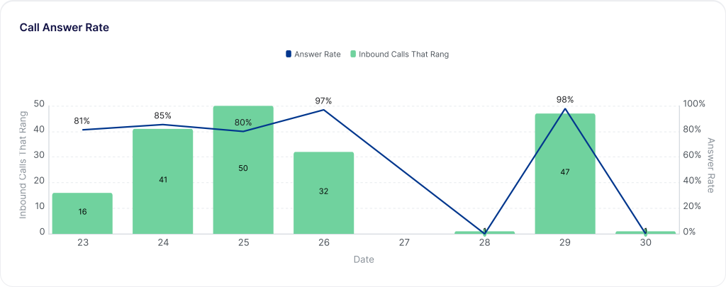
Call Answer Rate. See the share of inbound calls that were actually answered versus missed — out of calls that rang through, not ones sent straight to voicemail. Break it out by phone line to spot exactly which number is missing the most calls.
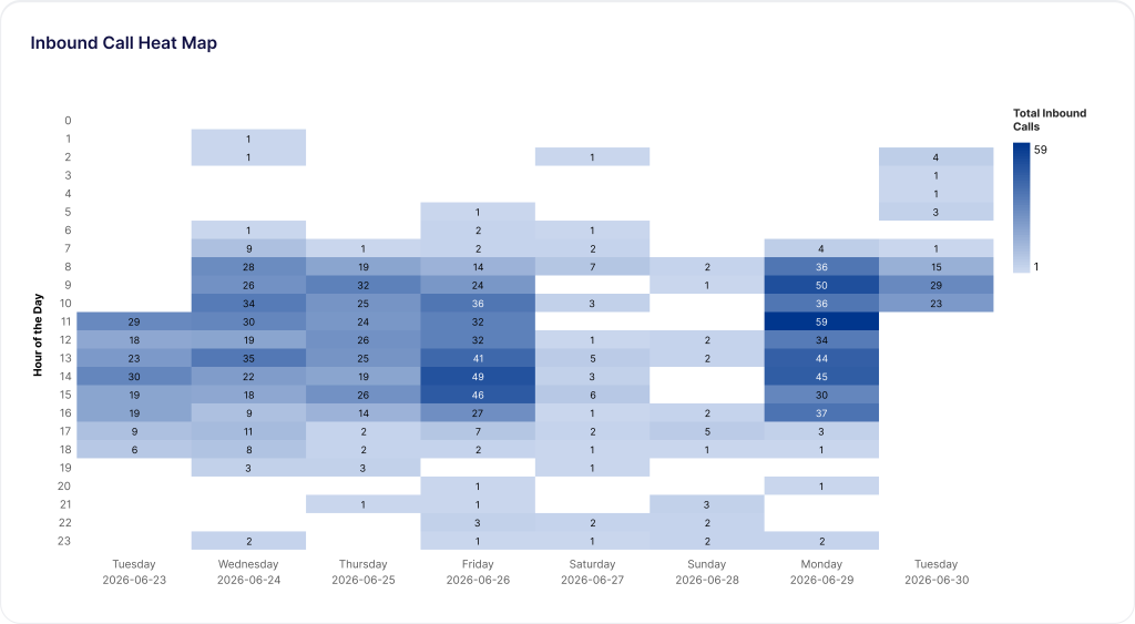
Inbound & outbound heat maps. Calls and messages, mapped by hour and day of the week. Darker cells mean busier times. It’s the fastest way to see when your practice actually gets hit with volume — and to staff around it instead of guessing.
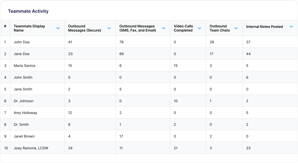
Teammate activity & paging. A per-teammate breakdown of messages handled, calls placed and answered, video visits completed, and internal notes posted — plus paging volume and resolution time, so you can see how quickly urgent internal requests get handled across the team.
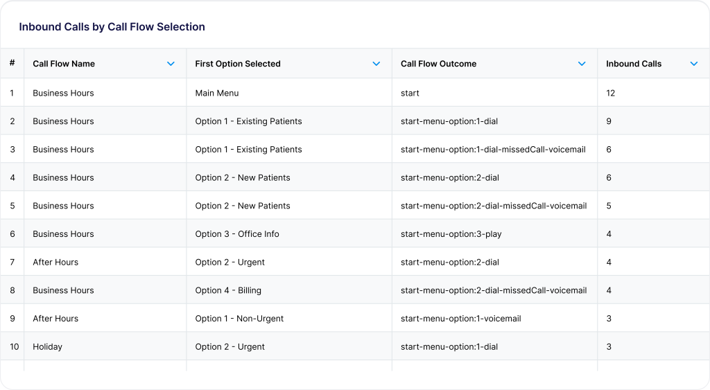
Call flow selection analytics. See how callers move through your call flow menu — which options they pick, and how those calls resolve — so you know if your IVR is actually routing people where they need to go.
Taken together, these four views answer the questions practices ask us most: where volume is coming from, whether calls are getting answered, whether staff are overloaded, and whether your call flow is actually working.
How to access it
See your dashboard any time and share with your team.
- Go to Settings → Dashboards on web or desktop.
- Every active org is already enabled.
- Use the time zone selector to make sure every chart lines up with how your team actually works.
- Export or print anytime: download any chart’s underlying data as CSV or XLSX, export a single chart as an image, or print/save the whole dashboard as a PDF to share with your team.
Want a chart-by-chart walkthrough of what each report shows? The Help Center has a full breakdown.
What’s ahead
This is the first version of Spruce Dashboards, and we’re not done. Next up: the ability to filter your dashboard to a specific date range, so you can look back at a particular week, month, or stretch of time — not just the trailing 7 days. More to come as we continue building out reporting for your practice.
On Basic and ready for the advanced analytics dashboard? Visit your dashboard in Spruce to upgrade
New to Spruce? See how Spruce Dashboards work